The Public Theater
Website Refresh
The Public Theater is theater of, by, and for all people. Artist-driven, radically inclusive, and fundamentally democratic, The Public continues the work of its visionary founder Joe Papp as a civic institution engaging, both on-stage and off, with some of the most important ideas and social issues of today. With the team at Radish Lab, I contributed to the Public's website refresh as a UX consultant.
Project Overview
The Challenge
The Public Theater came to Radish Lab looking for a refresh in their UX design, while maintaining their well-known brand.
My Role
UX Consultant. I worked alongside the Visual Designer and Project Manager at Radish Lab during the discovery and initial design phase of the project.
Timeline
November 2018 - January 2019
Research Methods
-

Discovery Meeting
The first part of our process was to join with The Public Theater’s team in a discovery meeting. Our goal of this meeting was to understand The Public Theater’s wants and challenges with the current website. This meeting was an afternoon long, where our team focused on understand the website as it currently stands.
-

Competitive/Comparative Analysis
We asked The Public Theater to give us competitive benchmarks as a way to understand what is best practice, what design features have been successful as well as what could be done different. It also gave The Public Theater a way to translate some of their ideas and expectations.
-

Card Sorting
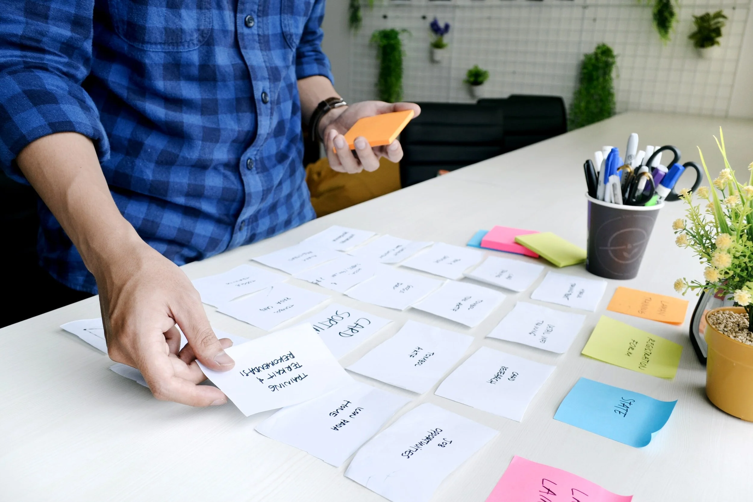
Since our team understood the navigation as a challenge for the website, we conducted a closed card sorting session in Optimal Workshop to see if users understood the current site navigation.
Synthesis
Main Findings From Research
Our team came together to synthesis our research to plan an approach for our designs.
-
Content Block Approach
The Public Theater needed an approach that would let them add and remove content on different pages, without disrupting the consistent design and brand.
-
Update Page Structures
The website had lots of beautiful and important content, but it was not intuitively organized.
-
Navigation and Info Architecture Refresh
We reviewed 10 responses from the card sorting workshop and discovered the areas that were clear as well as confusing to users to design a new, more intuitive navigation.
Design & Development
Re-Organizing Site Structure
Based on our navigations and info architecture findings from research, we began the design process with the primary navigation. The image shows our recommended sitemap.
Design Iterations
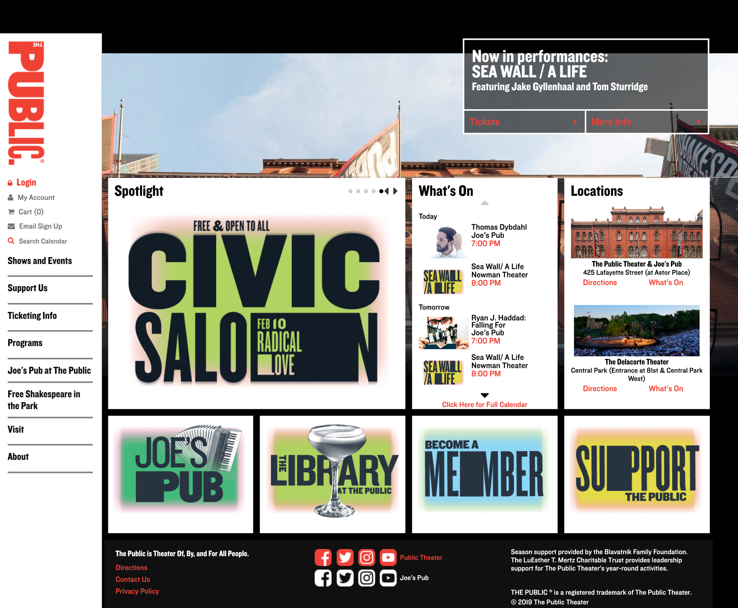
The visual designer and I worked closely on design iterations. While I focused more on the structure of the site through sitemapping and wireframing, the visual designer would then apply the brand to my wireframes for high-fidelity mockups to be delivered to the client.
-

ORIGINAL WEBSITE
-

WIREFRAME
-

UPDATED DESIGN
Conclusion & Next Steps
I'm honored to be part of The Public Theater's website refresh. As a reputable and beautifully designed brand, it was a great experience to learn how to adapt their website while maintaining the overall look and feel of The Public Theater.
The team at Radish Lab was truly an environment of innovation and creativity. The team was supportive of my UX work, while also bringing years of knowledge and experience to my process.
This was the first project I had to think strategically about flexibility and consistency. As a young designer, I often approached my projects page by page rather than a system as a whole. The Public Theater’s website refresh was a turning point in my design experience where I began to consider component design, rather than page design.


